How Photography Shapes Podcast Brand Identity
- Dec 11, 2025
- 3 min read
Updated: Dec 15, 2025
Photography became one of the strongest anchors for Polegorithms. The podcast space is saturated, and the visual landscape is basically a scroll of competing identities. If the artwork doesn't stand out on platforms like Spotify or Apple Podcasts, the show disappears before it even begins. We knew the imagery had to feel intentional, elevated, and confident enough to compete with everything from podcast key art to album covers.
Where the Visual Direction Started
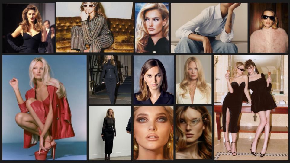
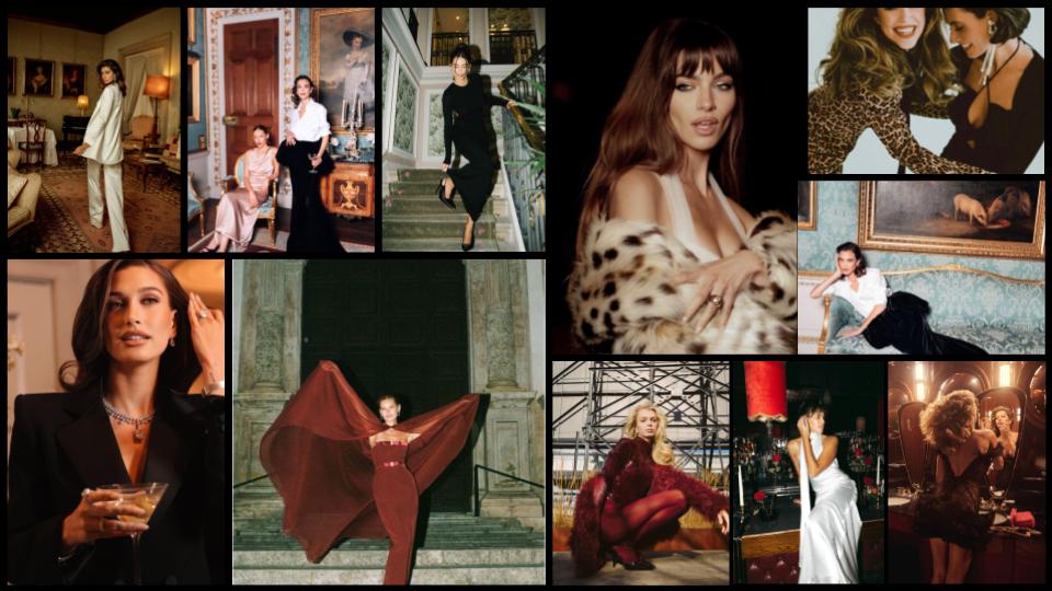
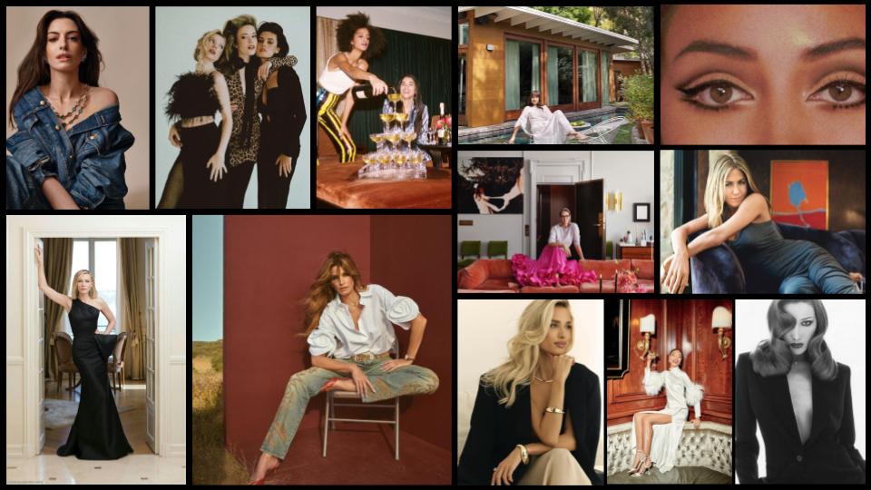
Before any production planning, we built out mood boards that set the tone. Not aspirational for the sake of aesthetics, but functional visuals that defined the emotional range of the show. The boards leaned into clean editorial styling, strong beauty moments, cinematic structure, and the timeless confidence you see in 90s supermodel campaigns. Think sharp tailoring, off-camera attitude, restrained glamour, and minimal fuss. The goal was not to mimic anything. It was to identify the energy that would translate across marketing assets, social clips, thumbnails, press kits, and long-term brand identity.
Mood boards also gave the team a shared visual vocabulary. Wardrobe, glam, lighting, set design, and photography all worked cohesively because everyone understood the direction long before shoot day. This is what separates strong creative direction from guesswork.
Production Planning With Intention
The location mattered. Polegorithms needed an environment that didn’t overpower the hosts, but still framed them with clarity and presence. We looked for spaces with clean lines, controlled light, and the ability to move through multiple setups quickly. Having a strong pre-production plan meant we could maximize the day without sacrificing the quality of any shot.
Good photography depends on rhythm, and rhythm depends on preparation. Wardrobe was mapped against backdrop colors. Glam was structured around lighting. The shot list was designed to give us a mix of hero frames and supporting assets that would work across podcast artwork, vertical video, trailers, and promotional graphics. None of this was accidental. This is where production and strategy meet.
Shooting for Longevity
During the shoot, we kept the direction simple. The hosts needed to feel like themselves, not like they were performing. Photography that lasts comes from ease, not over-direction. We focused on clean angles, strong silhouettes, and beauty shots that translate across platforms.
Since the podcast touches on ambition, reinvention, humor, and the reality of women’s lives, the imagery needed the same duality. Polished, but human. Confident, but not forced. Elevated, but still accessible. These are the kinds of visuals that continue to work long after launch.
Retouching With Restraint
Retouching is where the final tone of the brand locks in. Our approach is always editorial, not cosmetic. We refined lighting, color balance, contrast, and depth without erasing texture. This keeps the photography sophisticated and timeless, and it ensures the imagery holds its own next to major entertainment brands. Good retouching should feel invisible. The viewer should feel the impact, not notice the edits.
Why This Level of Photography Matters
Podcast branding today is more than a cover graphic. It is a full visual identity system. Strong photography gives the brand a foundation for:
• High-performing social assets
• Recognizable thumbnails
• Cohesive marketing campaigns
• Press and partnership opportunities
• Community building
• Long-term brand equity
This is why investing in creative direction and production planning matters. Strategy shows up in the details. Polegorithms will continue to expand visually because the foundation was built with intention, not shortcuts.
If you want your podcast or brand visuals to actually compete in a crowded market, this is the level of preparation and execution that makes a difference. Get in touch to start working with us on your brand today.


Comments